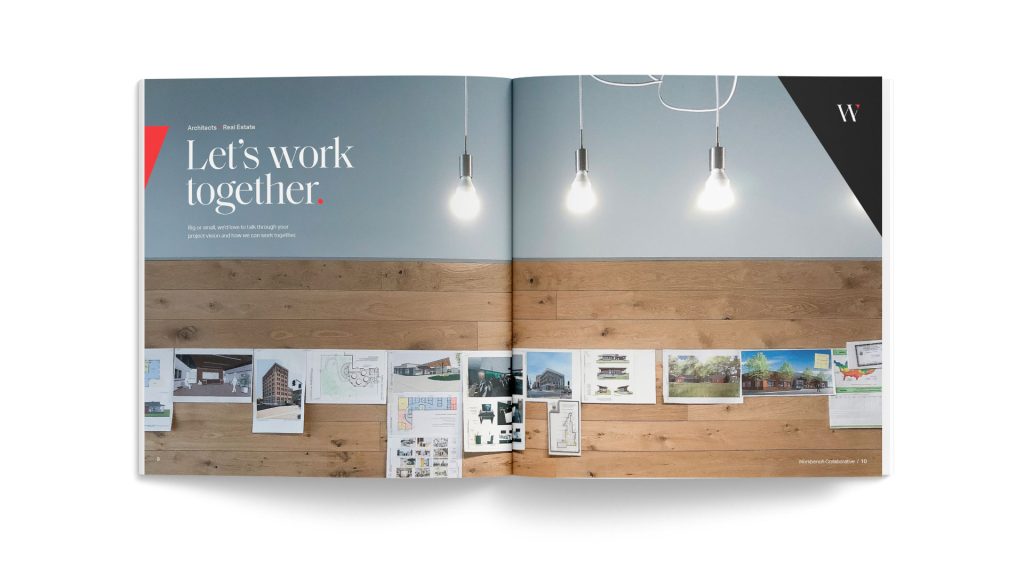
Reimagining an architectural and real estate firm. New branding, messaging, and process.
BRAND • WEBSITE • STRATEGY • MESSAGING • ANIMATION • PHOTOGRAPHY
Our team greatly enjoyed working with the Workbench team to reimagine their firm. By bringing definition and clarity to the “Collaborative” and helping create a new “Process” for new and prospective clients. Through our Discovery, we worked together to define how the Architectural and Real Estate wing, though separate, worked hand-in-hand to move their mission forward. This new brand helps continue their efforts to make every space meaningful.


The mark,
the process,
& messaging.
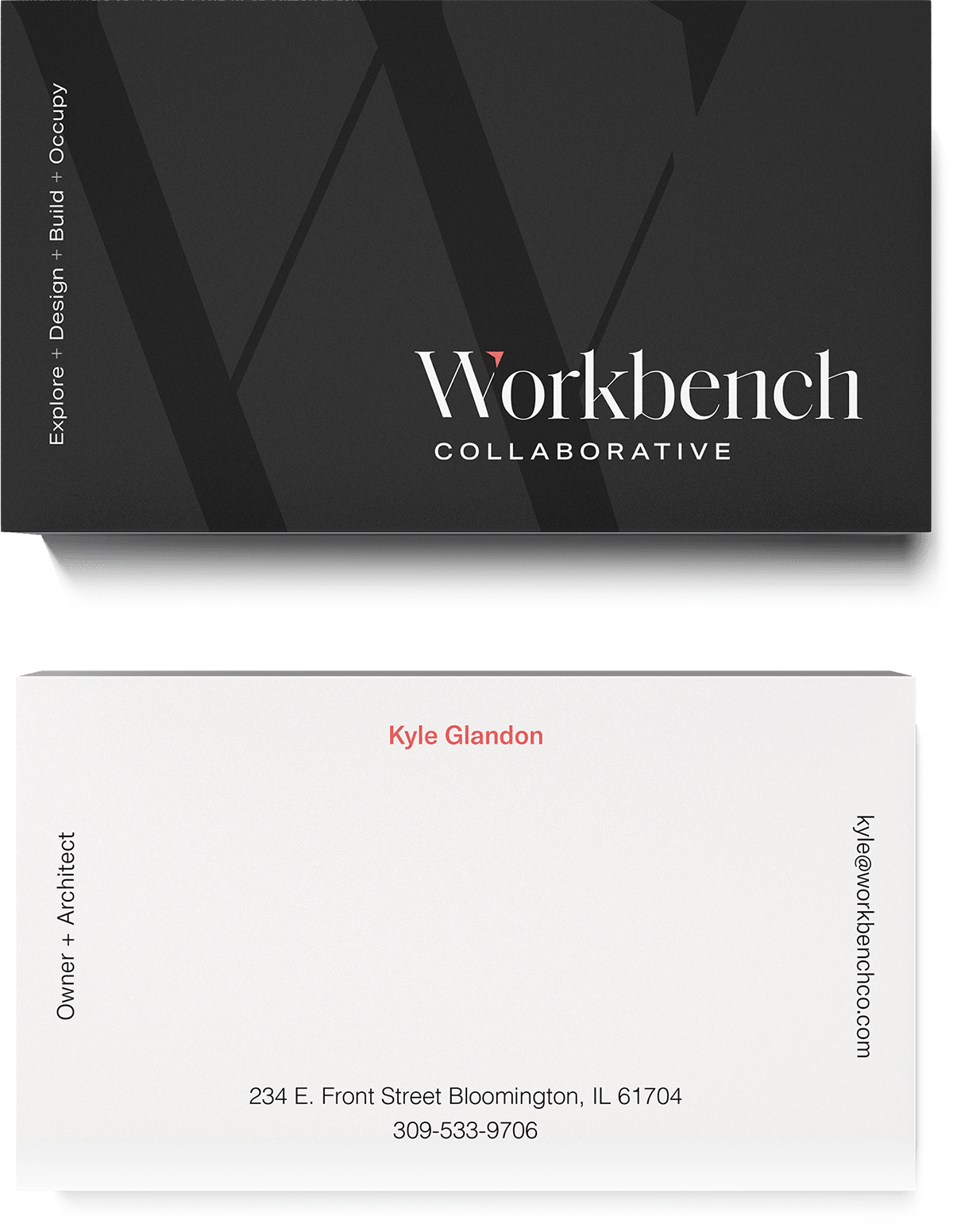
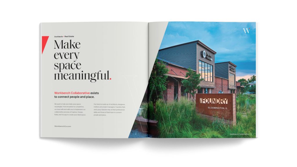
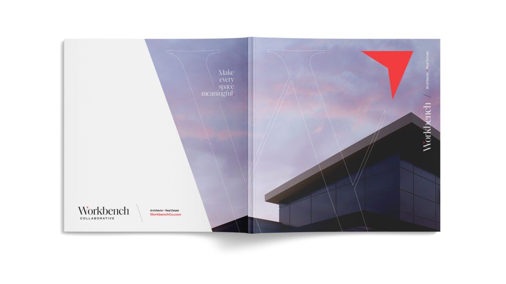
A new contemporary, yet eccentric serif wordmark exemplifies the intentional deviation from a conventional, expected approach to spaces and architecture, which Workbench embraces on every level.
We designed the red-orange North Arrow inside of the “W” as a staple in the architecture space that symbolizes direction and guidance – both of which Workbench provides. The “W” is used as its own standalone mark where brand awareness is high.

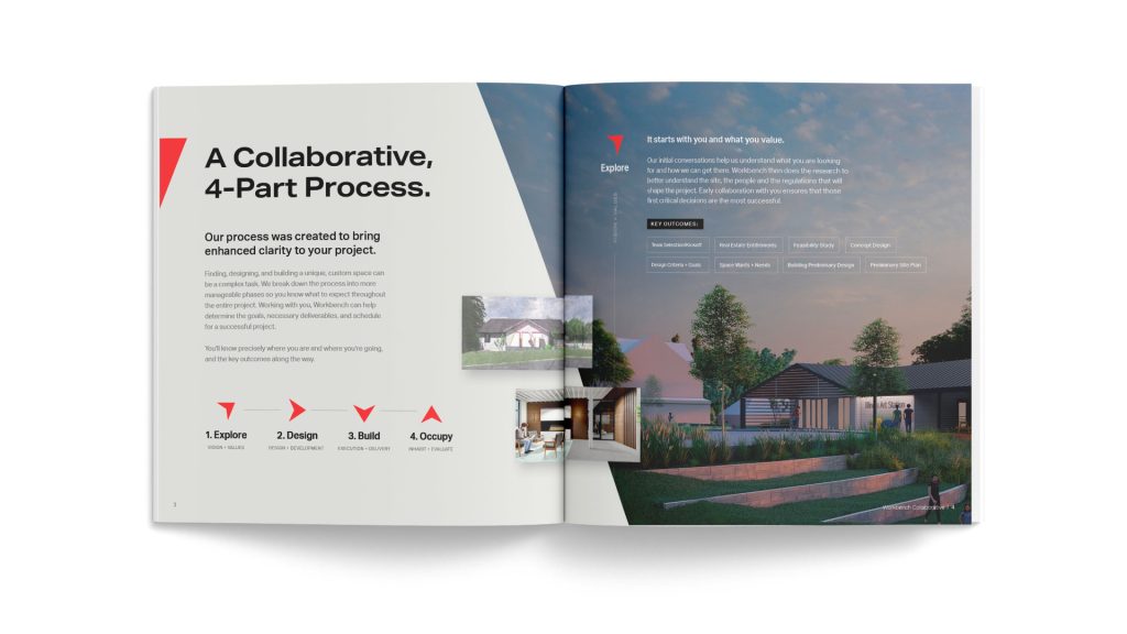
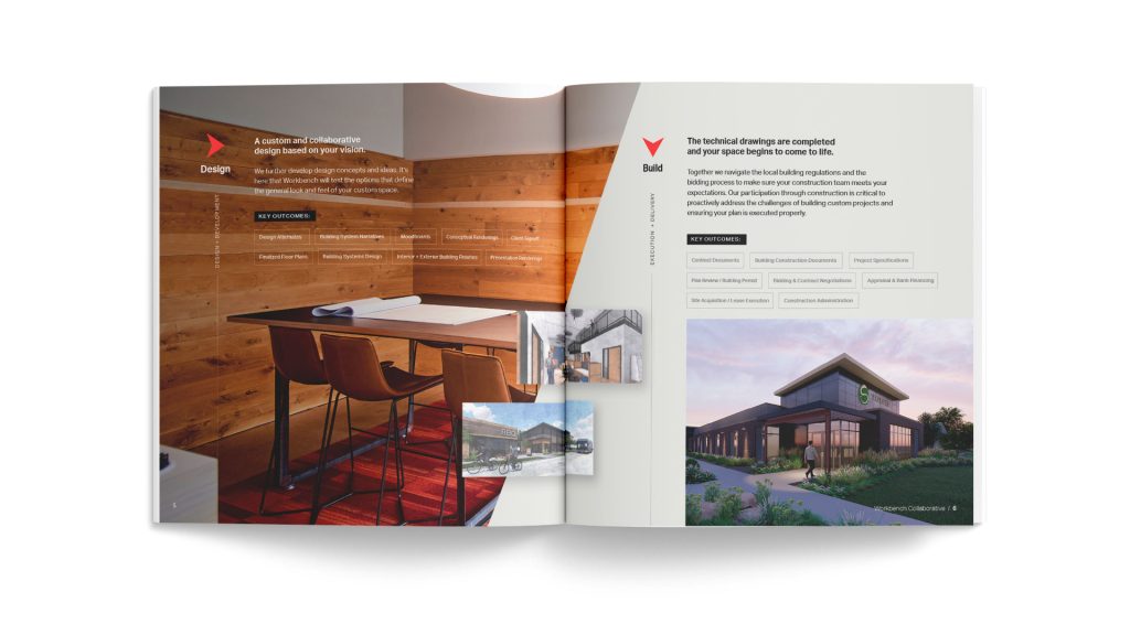
The Process
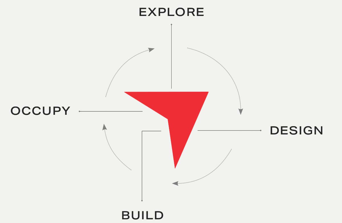
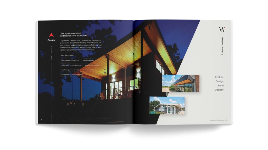
The 4-Part Workbench Process was created to bring enhanced clarity to each project – both internally and client-facing. When your customers know where they are and where they’re going, it builds trust and a sense of direction. Each side of the Northstar in the logo represents a part in the process. When completed, it provides direction and establishes a location.
Messaging
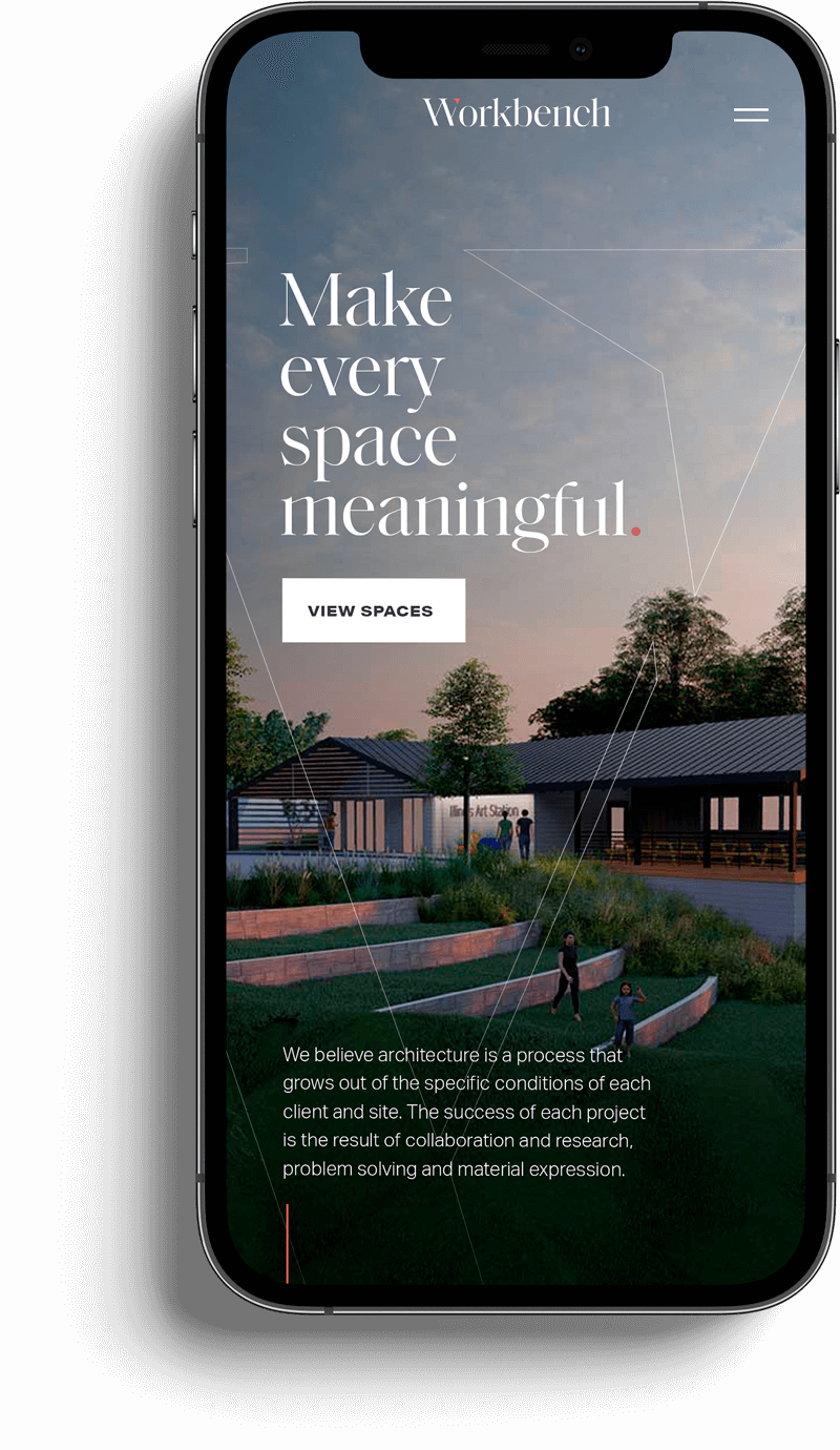
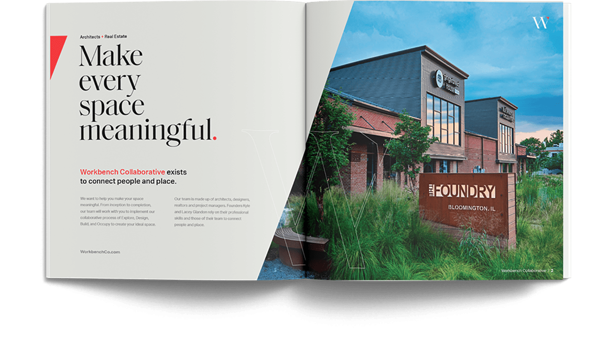
New, consistent messaging was created to give purpose for not only what Workbench does, but what every space should possess: meaning.
This new messaging embraced Workbench’s passion for every project, big and small, to create a meaningful environment for each client.

Colors
Colors matter with every brand. The colors that represent Workbench are charcoal, red, and a mix of cool and warm greys.
We use tints and shades to bring added depth and interest to the black and greys for the brand.
Charcoal Black
#242525
Workbench Red
#ee3035
Cool Grey
#7e7e7e
Warm Grey
#e5e6e1
White
#ffffff
Bringing it all together.
When the logomark, messaging, typography, colors, and imagery are used in unison it creates a beautiful and cohesive brand experience.
